> ## Documentation Index
> Fetch the complete documentation index at: https://docs-staging.auth0-mintlify.app/llms.txt
> Use this file to discover all available pages before exploring further.

# User Passkey Management

> Render a card-based UI that lets users enroll and revoke their own WebAuthn passkeys using the Auth0 My Account API.

export const ReleaseStageNotice = ({feature, stage, plans, contact, terms}) => {
  const stageTextMap = {
    "beta": "Beta",
    "ea": "Early Access"
  };
  const stageText = stageTextMap[stage] || "a product release stage";
  const prsLink = "/docs/troubleshoot/product-lifecycle/product-release-stages";
  const linkify = (text, url) => {
    return <a href={url} target="_blank" rel="noreferrer" class="link">{text}</a>;
  };
  const includeDetails = (plans, contact, terms) => {
    const hasDetails = terms || plans || contact;
    if (!hasDetails) return null;
    return <span data-as="p">
            {plans && <>This feature is available for {linkify(`${plans} plans`, "https://auth0.com/pricing")}. </>}
            {contact && "To participate, contact " + contact + ". "}
            {terms && <>By using this feature, you agree to the applicable Free Trial terms in Okta's {linkify("Master Subscription Agreement", "https://www.okta.com/legal")}.</>}
        </span>;
  };
  return <Warning>
            <span data-as="p">
                <strong>The {feature} feature is in {linkify(stageText, prsLink)}.</strong>
            </span>

            {includeDetails(plans, contact, terms)}
        </Warning>;
};

<ReleaseStageNotice feature="Auth0 Universal Components" stage="beta" terms="true" contact="Auth0 Support" />

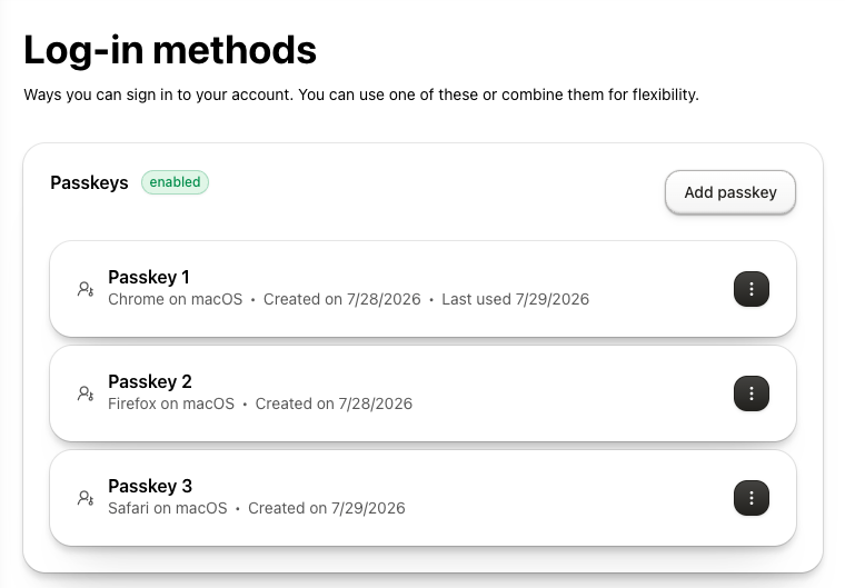
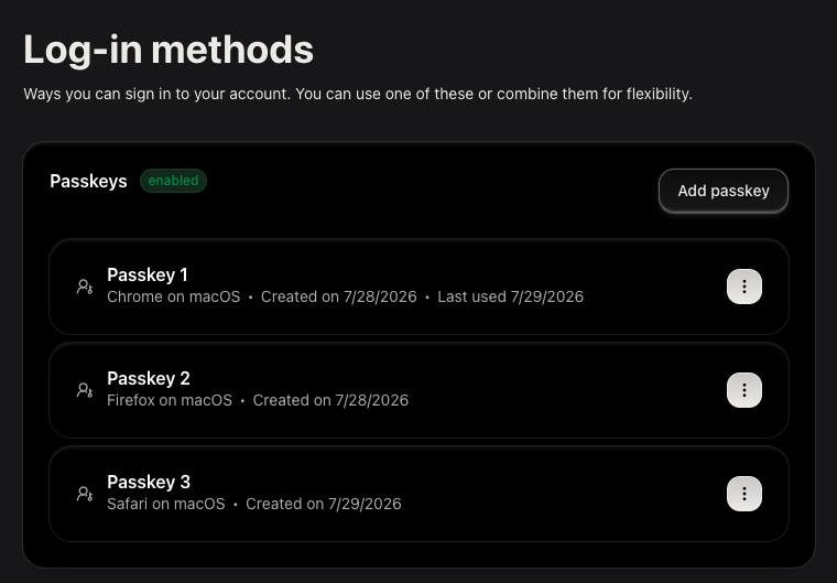
The `UserPasskeyManagement` component lets users enroll and revoke [passkeys](/docs/authenticate/database-connections/passkeys) in a single card-based interface using the [My Account API](/docs/manage-users/my-account-api) and requires no props to render.
The component renders a list of enrolled passkeys, a button to add a new passkey, and a revoke option.

<Frame>
  <img className="block dark:hidden" src="https://mintlify.s3.us-west-1.amazonaws.com/docs-staging/docs/images/universal-components/my-account/web/user-passkey-management-light.png" alt="User Passkey Management component showing enrolled passkeys" />

  <img className="hidden dark:block" src="https://mintlify.s3.us-west-1.amazonaws.com/docs-staging/docs/images/universal-components/my-account/web/user-passkey-management-dark.png" alt="User Passkey Management component showing enrolled passkeys" />
</Frame>

## Prerequisites

To enable passkey support:

* **Configure a custom domain on your Auth0 tenant**. Passkeys require a [custom domain](/docs/customize/custom-domains).

* **Enable passkeys on your Auth0 database connection**. To learn how to enable passkeys in your Auth0 tenant, read [Configure Passkeys](/docs/authenticate/database-connections/passkeys/configure-passkey-policy#configure-passkeys).

* **Match origin**. The relying party id must equal your application’s domain or be a registrable parent of it. To learn more, read [Relying party ID for Passkeys](/docs/authenticate/database-connections/passkeys#relying-party-id-for-passkeys)

* **Ensure your application uses HTTPS**. WebAuthn requires that your application is served over HTTPS.

* **Install and configure universal components in your application**. To install and configure universal components, read [Build Account Security UI](/docs/get-started/universal-components/web/components/my-account-overview#prerequisites).

## Configure your application

Select your framework to configure environment variables and universal components.

<Tabs>
  <Tab title="React (SPA)">
    ## Install the component

    <CodeGroup>
      ```bash pnpm wrap lines theme={null}
      pnpm add @auth0/universal-components-react react-hook-form @tanstack/react-query
      ```

      ```bash npm wrap lines theme={null}
      npm install @auth0/universal-components-react react-hook-form @tanstack/react-query
      ```
    </CodeGroup>

    <Callout icon="file-lines" color="#0EA5E9" iconType="regular">
      `react-hook-form` and `@tanstack/react-query` are peer dependencies. The command also installs the `@auth0/universal-components-core` dependency for shared utilities and Auth0 integration.
    </Callout>

    ## Get started

    ```tsx wrap lines theme={null}
    import { UserPasskeyManagement } from "@auth0/universal-components-react";

    export function SecurityPage() {
      return <UserPasskeyManagement />;
    }
    ```

    <Callout icon="file-lines" color="#0EA5E9" iconType="regular">
      * Components are always imported from the root entry `@auth0/universal-components-react`, regardless of framework.
      * Only the `Auth0ComponentProvider` component uses a framework-specific subpath: `/spa` for React applications, `/rwa` for Next.js applications.
    </Callout>

    <Accordion title="Full integration example">
      ```tsx wrap lines theme={null}
      import React from "react";
      import { UserPasskeyManagement } from "@auth0/universal-components-react";
      import { Auth0Provider } from "@auth0/auth0-react";
      import { Auth0ComponentProvider } from "@auth0/universal-components-react/spa";
      import { analytics } from "./lib/analytics";

      function SecurityPage() {
        return (
          <div className="max-w-3xl mx-auto p-6">
            <UserPasskeyManagement
              addAction={{
                onAfter: () => {
                  analytics.track("Passkey Enrolled");
                },
              }}
              revokeAction={{
                onBefore: (passkey) =>
                  window.confirm(`Remove passkey "${passkey.name}"?`),
                onAfter: (passkey) => {
                  analytics.track("Passkey Revoked", { passkeyId: passkey.id });
                },
              }}
              customMessages={{
                header: {
                  title: "Passkeys",
                  description: "Sign in faster and more securely without a password.",
                },
              }}
              styling={{
                variables: {
                  light: { "--color-primary": "#4f46e5" },
                  dark: { "--color-primary": "#818cf8" },
                },
              }}
            />
          </div>
        );
      }

      export default function App() {
        const domain = "YOUR_TENANT_DOMAIN.auth0.com";
        const clientId = "YOUR_CLIENT_ID";

        return (
          <Auth0Provider
            domain={domain}
            clientId={clientId}
            authorizationParams={{ redirect_uri: window.location.origin }}
            interactiveErrorHandler="popup"
          >
            <Auth0ComponentProvider domain={domain}>
              <SecurityPage />
            </Auth0ComponentProvider>
          </Auth0Provider>
        );
      }
      ```
    </Accordion>
  </Tab>

  <Tab title="Next.js (RWA)">
    ## Install the component

    <CodeGroup>
      ```bash pnpm wrap lines theme={null}
      pnpm add @auth0/universal-components-react react-hook-form @tanstack/react-query
      ```

      ```bash npm wrap lines theme={null}
      npm install @auth0/universal-components-react react-hook-form @tanstack/react-query
      ```
    </CodeGroup>

    <Callout icon="file-lines" color="#0EA5E9" iconType="regular">
      `react-hook-form` and `@tanstack/react-query` are peer dependencies. The command also installs the `@auth0/universal-components-core` dependency for shared utilities and Auth0 integration.
    </Callout>

    ## Get started

    ```tsx app/security/passkeys/page.tsx wrap lines theme={null}
    "use client";

    import { UserPasskeyManagement } from "@auth0/universal-components-react";

    export default function PasskeysPage() {
      return <UserPasskeyManagement />;
    }
    ```

    <Accordion title="Full integration example">
      ```tsx app/security/passkeys/page.tsx wrap lines theme={null}
      "use client";

      import { UserPasskeyManagement } from "@auth0/universal-components-react";
      import { analytics } from "@/lib/analytics";

      export default function PasskeysPage() {
        return (
          <div className="max-w-3xl mx-auto p-6">
            <UserPasskeyManagement
              addAction={{
                onAfter: () => {
                  analytics.track("Passkey Enrolled");
                },
              }}
              revokeAction={{
                onAfter: (passkey) => {
                  analytics.track("Passkey Revoked", { passkeyId: passkey.id });
                },
              }}
              customMessages={{
                header: {
                  title: "Passkeys",
                  description: "Sign in faster and more securely without a password.",
                },
              }}
              styling={{
                variables: {
                  light: { "--color-primary": "#4f46e5" },
                  dark: { "--color-primary": "#818cf8" },
                },
              }}
            />
          </div>
        );
      }
      ```
    </Accordion>
  </Tab>

  <Tab title="shadcn">
    ## Install the component

    ```bash wrap lines theme={null}
    npx shadcn@latest add https://auth0-universal-components.vercel.app/r/my-account/user-passkey-management.json
    ```

    <Callout icon="file-lines" color="#0EA5E9" iconType="regular">
      The install command adds the component source into `src/components/auth0/my-account/` along with all UI dependencies and the `@auth0/universal-components-core` dependency for shared utilities and Auth0 integration.
    </Callout>

    ## Get started

    ```tsx wrap lines theme={null}
    import { UserPasskeyManagement } from "@/components/auth0/my-account/user-passkey-management";

    export function SecurityPage() {
      return <UserPasskeyManagement />;
    }
    ```

    <Accordion title="Full integration example">
      ```tsx wrap lines theme={null}
      import React from "react";
      import { UserPasskeyManagement } from "@/components/auth0/my-account/user-passkey-management";
      import { Auth0Provider } from "@auth0/auth0-react";
      import { Auth0ComponentProvider } from "@auth0/universal-components-react/spa";
      import { analytics } from "./lib/analytics";

      function SecurityPage() {
        return (
          <div className="max-w-3xl mx-auto p-6">
            <UserPasskeyManagement
              addAction={{
                onAfter: () => {
                  analytics.track("Passkey Enrolled");
                },
              }}
              revokeAction={{
                onBefore: (passkey) =>
                  window.confirm(`Remove passkey "${passkey.name}"?`),
                onAfter: (passkey) => {
                  analytics.track("Passkey Revoked", { passkeyId: passkey.id });
                },
              }}
              customMessages={{
                header: {
                  title: "Passkeys",
                  description: "Sign in faster and more securely without a password.",
                },
              }}
              styling={{
                variables: {
                  light: { "--color-primary": "#4f46e5" },
                  dark: { "--color-primary": "#818cf8" },
                },
              }}
            />
          </div>
        );
      }

      export default function App() {
        const domain = "YOUR_TENANT_DOMAIN.auth0.com";
        const clientId = "YOUR_CLIENT_ID";

        return (
          <Auth0Provider
            domain={domain}
            clientId={clientId}
            authorizationParams={{ redirect_uri: window.location.origin }}
            interactiveErrorHandler="popup"
          >
            <Auth0ComponentProvider domain={domain}>
              <SecurityPage />
            </Auth0ComponentProvider>
          </Auth0Provider>
        );
      }
      ```
    </Accordion>
  </Tab>
</Tabs>

## Props

### Display props

Display props control how the component renders without affecting its behavior.

<table class="table">
  <thead>
    <tr>
      <th>Prop</th>
      <th>Type</th>
      <th>Default</th>
      <th>Description</th>
    </tr>
  </thead>

  <tbody>
    <tr>
      <td><code>hideHeader</code></td>
      <td><code>boolean</code></td>
      <td><code>false</code></td>
      <td>Hide the page-level header (title and description). The section card with the passkey list is always shown.</td>
    </tr>
  </tbody>
</table>

### Action props

Action props let you hook into the component’s lifecycle events and trigger or cancel operations.

<table class="table">
  <thead>
    <tr>
      <th>Prop</th>
      <th>Type</th>
      <th>Description</th>
    </tr>
  </thead>

  <tbody>
    <tr>
      <td><code>addAction</code></td>
      <td><code>ComponentAction\<void></code></td>
      <td>Lifecycle hooks for the add-passkey flow. Set <code>disabled: true</code> to hide the add button.</td>
    </tr>

    <tr>
      <td><code>revokeAction</code></td>
      <td><code>ComponentAction\<Passkey></code></td>
      <td>Lifecycle hooks for the revoke-passkey flow. Set <code>disabled: true</code> to hide the revoke option.</td>
    </tr>

    <tr>
      <td><code>onFetch</code></td>
      <td><code>() => void</code></td>
      <td>Triggered after the passkey list is successfully loaded.</td>
    </tr>
  </tbody>
</table>

**addAction**

Controls the add a passkey flow. `onBefore` triggers before the browser WebAuthn prompt is shown; return `false` to cancel (for example, to enforce a passkey limit). `onAfter` triggers after the new passkey is saved.

* `disabled` hide the "Add passkey" button.
* `onBefore()` runs before the WebAuthn enrollment ceremony. Return `false` to cancel.
* `onAfter()` runs after the passkey is successfully registered. Use this to refresh session state or send analytics.

```tsx wrap lines theme={null}
<UserPasskeyManagement
  addAction={{
    onBefore: () => {
      if (passkeys.length >= 5) {
        toast.error("You can register a maximum of 5 passkeys.");
        return false;
      }
      return true;
    },
    onAfter: () => {
      analytics.track("Passkey Enrolled");
    },
  }}
/>
```

**revokeAction**

Controls the revoke a passkey flow. `onBefore` runs before the built-in confirmation modal is shown, so you can cancel the flow before the user sees the modal. `onAfter` triggers after the passkey is deleted from the account.

* `disabled` hides the revoke option from the passkey actions menu.
* `onBefore(passkey)` runs before the revoke API call. Receives the `Passkey` object. Return `false` to cancel.
* `onAfter(passkey)` runs after the passkey is successfully revoked. Receives the revoked `Passkey` object.

```tsx wrap lines theme={null}
<UserPasskeyManagement
  revokeAction={{
    onAfter: (passkey) => {
      auditLog.record({ action: "passkey_revoked", passkeyId: passkey.id });
    },
  }}
/>
```

**onFetch**

Triggers after the passkey list is successfully loaded on mount. Use this to show or hide adjacent UI that depends on whether the user has any registered passkeys.

```tsx wrap lines theme={null}
<UserPasskeyManagement
  onFetch={() => {
    setPasskeysLoaded(true);
  }}
/>
```

To render the list read-only, set `disabled: true` on both actions:

```tsx wrap lines theme={null}
<UserPasskeyManagement
  addAction={{ disabled: true }}
  revokeAction={{ disabled: true }}
/>
```

### Customize props

Customization props let you adapt copy and styling without modifying source code.

<table class="table">
  <thead>
    <tr>
      <th>Prop</th>
      <th>Type</th>
      <th>Description</th>
    </tr>
  </thead>

  <tbody>
    <tr>
      <td><code>customMessages</code></td>
      <td><code>Partial\<UserPasskeyManagementMessages></code></td>
      <td>Override default UI text and translations.</td>
    </tr>

    <tr>
      <td><code>styling</code></td>
      <td><code>ComponentStyling\<UserPasskeyManagementClasses></code></td>
      <td>CSS variables and class overrides.</td>
    </tr>
  </tbody>
</table>

**customMessages**

Customize all text and translations. Every field is optional.

<Accordion title="Available Messages">
  * **header**—`title`, `description` (page-level header; hidden when `hideHeader` is `true`)
  * **Top-level card**—`section_title`, `enabled` (badge shown when passkeys are enrolled), `no_passkeys` (empty state message), `add_passkey` (add button label)
  * **List items**—`created_at` (use `${date}` as placeholder), `last_used` (use `${date}` as placeholder)
  * **Actions**—`actions.revoke` (label in the per-passkey actions menu)
  * **Success toasts**—`success.add`, `success.revoke`
  * **Revoke modal**—`modals.revoke.title`, `modals.revoke.consent` (use `<bold>${name}</bold>` to bold the passkey name), `modals.revoke.cancel`, `modals.revoke.confirm`
</Accordion>

```tsx wrap lines theme={null}
<UserPasskeyManagement
  customMessages={{
    header: {
      title: "Passkeys",
      description: "Sign in faster and more securely without a password.",
    },
    section_title: "Your passkeys",
    no_passkeys: "No passkeys registered yet.",
    add_passkey: "Add a passkey",
    created_at: "Added ${date}",
    last_used: "Last used ${date}",
    success: {
      add: "Passkey registered successfully.",
      revoke: "Passkey removed.",
    },
    modals: {
      revoke: {
        title: "Remove passkey?",
        consent: "This will permanently remove <bold>${name}</bold>.",
        cancel: "Cancel",
        confirm: "Remove",
      },
    },
  }}
/>
```

**Customize style**

Customize appearance with CSS variables and class overrides. Supports light/dark themes.

<Accordion title="Available Styling Options">
  **Variables**—CSS custom properties

  * `common` Applied to both themes
  * `light` Light mode only
  * `dark` Dark mode only

  **Class overrides**

  * `UserPasskeyManagement-root` the outer card container wrapping the passkey list
  * `UserPasskeyManagement-item` each individual passkey row card
  * `PasskeyActionModal-modalContent` the revoke confirmation modal content area
</Accordion>

```tsx wrap lines theme={null}
<UserPasskeyManagement
  styling={{
    variables: {
      light: { "--color-primary": "#4f46e5" },
      dark: { "--color-primary": "#818cf8" },
    },
    classes: {
      "UserPasskeyManagement-root": "rounded-2xl shadow-md",
      "UserPasskeyManagement-item": "rounded-xl border border-gray-200",
      "PasskeyActionModal-modalContent": "max-w-sm",
    },
  }}
/>
```

## TypeScript definitions

```typescript wrap lines theme={null}
interface Passkey {
  id: string;
  name?: string;
  createdAt?: string;
  lastUsedAt?: string;
  deviceInfo?: string;
}

interface UserPasskeyManagementClasses {
  "UserPasskeyManagement-root"?: string;
  "UserPasskeyManagement-item"?: string;
  "PasskeyActionModal-modalContent"?: string;
}

// ComponentAction provides before/after hooks and a disabled flag.
// Both hooks receive the same data type T.
interface ComponentAction<Item, Context = void> {
  disabled?: boolean;
  onBefore?: (item: Item, context?: Context) => boolean;
  onAfter?: (item: Item, context?: Context) => void | boolean | Promise<boolean>;
}

interface UserPasskeyManagementProps {
  hideHeader?: boolean;
  customMessages?: Partial<UserPasskeyManagementMessages>;
  styling?: ComponentStyling<UserPasskeyManagementClasses>;
  addAction?: ComponentAction<void>;
  revokeAction?: ComponentAction<Passkey>;
  onFetch?: () => void;
}
```

## Advanced customization

In addition to the component configuration described above, use the `useUserPasskey` hook when you need to build a custom passkey management interface.

```tsx wrap lines theme={null}
import { useUserPasskey } from "@auth0/universal-components-react";

export function CustomPasskeyManagement() {
  const {
    passkeys,
    isLoading,
    isEnrolling,
    isRevoking,
    disableAdd,
    disableRevoke,
    currentPasskey,
    isRevokeModalOpen,
    setIsRevokeModalOpen,
    handleAddPasskey,
    handleRevokePasskey,
    handleConfirmRevoke,
  } = useUserPasskey({});

  if (isLoading) return <p>Loading passkeys…</p>;

  return (
    <>
      <button disabled={disableAdd || isEnrolling} onClick={handleAddPasskey}>
        Add passkey
      </button>

      <ul>
        {passkeys.map((passkey) => (
          <li key={passkey.id}>
            {passkey.name ?? "Unnamed passkey"}
            <button
              disabled={disableRevoke || isRevoking}
              onClick={() => handleRevokePasskey(passkey)}
            >
              Remove
            </button>
          </li>
        ))}
      </ul>

      {isRevokeModalOpen && currentPasskey && (
        <div role="dialog" aria-modal="true">
          <p>Remove {currentPasskey.name ?? "passkey"}?</p>
          <button disabled={isRevoking} onClick={handleConfirmRevoke}>
            Confirm removal
          </button>
          <button onClick={() => setIsRevokeModalOpen(false)}>Cancel</button>
        </div>
      )}
    </>
  );
}
```

The hook accepts `customMessages`, `addAction`, `revokeAction`, and `onFetch`. It returns passkey data, loading and action state, the active revocation target, and handlers for passkey enrollment and revocation.

Use `UserPasskeyManagement` when you want the built-in interface. If you use the hook, implement the matching revocation confirmation UI and its dismissal behavior.

## Learn more

<CardGroup cols={2}>
  <Card title="User MFA Management" icon="shield" href="/docs/get-started/universal-components/web/components/user-mfa-management">
    Manage MFA factors (TOTP, SMS, email OTP, push, recovery codes) alongside passkeys.
  </Card>

  <Card title="Build a Self-Service Account Security Interface" icon="key" href="/docs/get-started/universal-components/web/components/my-account-overview">
    Overview, prerequisites, and framework setup for all My Account components.
  </Card>
</CardGroup>
