

 Authenticate
 Manage Users
 Customize
 Platform
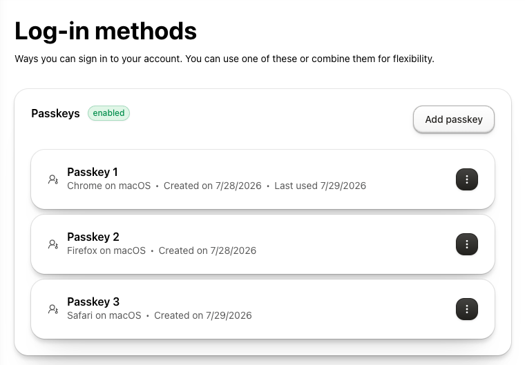
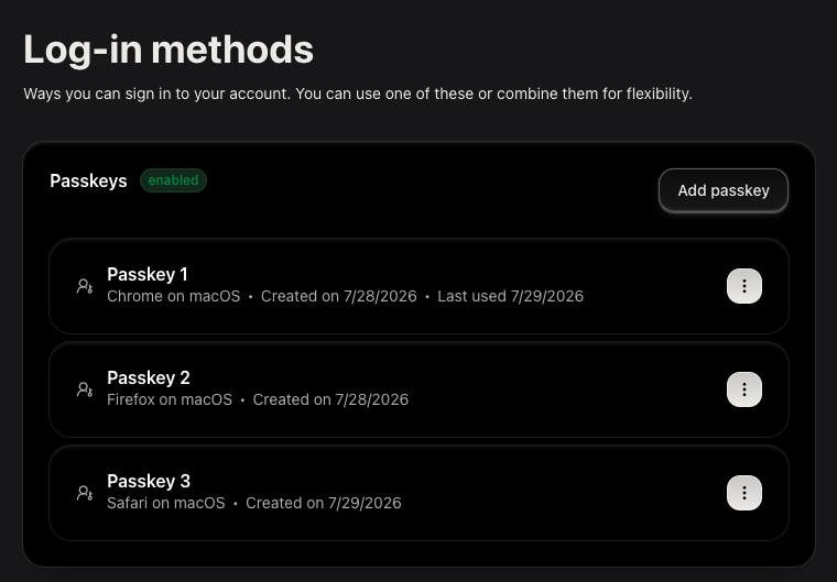
UserPasskeyManagement component lets users enroll and revoke passkeys in a single card-based interface using the My Account API and requires no props to render.
The component renders a list of enrolled passkeys, a button to add a new passkey, and a revoke option.
Prerequisites
To enable passkey support:- Configure a custom domain on your Auth0 tenant. Passkeys require a custom domain.
- Enable passkeys on your Auth0 database connection. To learn how to enable passkeys in your Auth0 tenant, read Configure Passkeys.
- Match origin. The relying party id must equal your application’s domain or be a registrable parent of it. To learn more, read Relying party ID for Passkeys
- Ensure your application uses HTTPS. WebAuthn requires that your application is served over HTTPS.
- Install and configure universal components in your application. To install and configure universal components, read Build Account Security UI.
Configure your application
Select your framework to configure environment variables and universal components.- React (SPA)
- Next.js (RWA)
- shadcn
Install the component
react-hook-form and @tanstack/react-query are peer dependencies. The command also installs the @auth0/universal-components-core dependency for shared utilities and Auth0 integration.Get started
- Components are always imported from the root entry
@auth0/universal-components-react, regardless of framework. - Only the
Auth0ComponentProvidercomponent uses a framework-specific subpath:/spafor React applications,/rwafor Next.js applications.
Full integration example
Full integration example
Props
Display props
Display props control how the component renders without affecting its behavior.| Prop | Type | Default | Description |
|---|---|---|---|
hideHeader | boolean | false | Hide the page-level header (title and description). The section card with the passkey list is always shown. |
Action props
Action props let you hook into the component’s lifecycle events and trigger or cancel operations.| Prop | Type | Description |
|---|---|---|
addAction | ComponentAction<void> | Lifecycle hooks for the add-passkey flow. Set disabled: true to hide the add button. |
revokeAction | ComponentAction<Passkey> | Lifecycle hooks for the revoke-passkey flow. Set disabled: true to hide the revoke option. |
onFetch | () => void | Triggered after the passkey list is successfully loaded. |
onBefore triggers before the browser WebAuthn prompt is shown; return false to cancel (for example, to enforce a passkey limit). onAfter triggers after the new passkey is saved.
disabledhide the “Add passkey” button.onBefore()runs before the WebAuthn enrollment ceremony. Returnfalseto cancel.onAfter()runs after the passkey is successfully registered. Use this to refresh session state or send analytics.
onBefore runs before the built-in confirmation modal is shown, so you can cancel the flow before the user sees the modal. onAfter triggers after the passkey is deleted from the account.
disabledhides the revoke option from the passkey actions menu.onBefore(passkey)runs before the revoke API call. Receives thePasskeyobject. Returnfalseto cancel.onAfter(passkey)runs after the passkey is successfully revoked. Receives the revokedPasskeyobject.
disabled: true on both actions:
Customize props
Customization props let you adapt copy and styling without modifying source code.| Prop | Type | Description |
|---|---|---|
customMessages | Partial<UserPasskeyManagementMessages> | Override default UI text and translations. |
styling | ComponentStyling<UserPasskeyManagementClasses> | CSS variables and class overrides. |
Available Messages
Available Messages
- header—
title,description(page-level header; hidden whenhideHeaderistrue) - Top-level card—
section_title,enabled(badge shown when passkeys are enrolled),no_passkeys(empty state message),add_passkey(add button label) - List items—
created_at(use${date}as placeholder),last_used(use${date}as placeholder) - Actions—
actions.revoke(label in the per-passkey actions menu) - Success toasts—
success.add,success.revoke - Revoke modal—
modals.revoke.title,modals.revoke.consent(use<bold>${name}</bold>to bold the passkey name),modals.revoke.cancel,modals.revoke.confirm
Available Styling Options
Available Styling Options
Variables—CSS custom properties
commonApplied to both themeslightLight mode onlydarkDark mode only
UserPasskeyManagement-rootthe outer card container wrapping the passkey listUserPasskeyManagement-itemeach individual passkey row cardPasskeyActionModal-modalContentthe revoke confirmation modal content area
TypeScript definitions
Advanced customization
In addition to the component configuration described above, use theuseUserPasskey hook when you need to build a custom passkey management interface.
customMessages, addAction, revokeAction, and onFetch. It returns passkey data, loading and action state, the active revocation target, and handlers for passkey enrollment and revocation.
Use UserPasskeyManagement when you want the built-in interface. If you use the hook, implement the matching revocation confirmation UI and its dismissal behavior.
Learn more
User MFA Management
Manage MFA factors (TOTP, SMS, email OTP, push, recovery codes) alongside passkeys.
Build a Self-Service Account Security Interface
Overview, prerequisites, and framework setup for all My Account components.